If you've ever clicked through page after page of stock icons trying to find the perfect one—and ended up frustrated—you're not alone. Stock icons are cost-effective but rarely match the vision you have for your brand.
How do you end the frustration? Custom icon illustration. From Lightboard, of course :)
Working with the Monumetrics team, we created four icon illustrations to represent their product's service tiers.
Inspiration
As we do on all of our custom illustration projects, we began by assembling a moodboard to align all key stakeholders with the vision before throwing ink to paper. On our kickoff call, we discussed possible themes—and continued to circle back to the idea of flight evolution. Rather than focus on actual aircraft, we decided to focus on the pilots' appearances throughout this evolution.
Kyle, our lead at Monumetric, wanted icons to represent the four tiers of their product. Like most SaaS products, they have different products for customers with different needs:
- Propel: 10k-80k Pageviews/Month
- Ascend: 80k-500k Pageviews/Month
- Stratos: 500k-10M Pageviews/Month
- Apollo: 10M+ Pageviews/Month
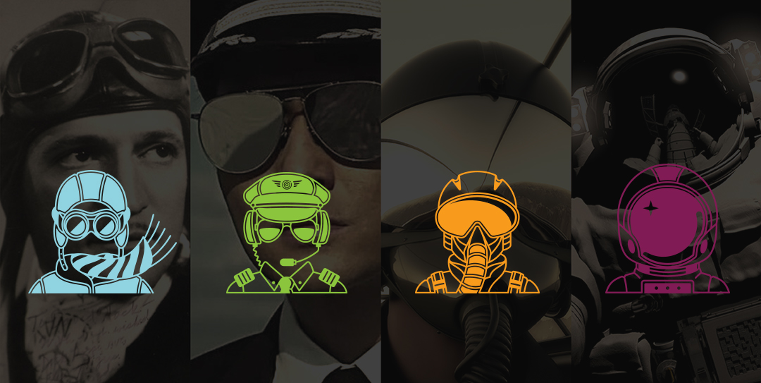
We decided to represent these tiers through pilots—from biplanes to space stations.

Pilot reference images
First Round Rough Sketches
Everyone was excited about the pilot theme, and we set to work on the first round of sketches with Micah, one of the great illustrators in our network. We presented four profiles:

First Round Rough Sketches
Second Round Rough Sketches
The first round of sketches looked great, but they were too obviously male. Not exactly the most inclusive icon design. We decided to simplify the illustrations to remove their distinguishing facial features, focusing on their eyewear/helmets.
To achieve this, we changed the subjects' position to face forward rather than in profile:

Second Round Sketches
Line Work
With the second round approved, we moved forward with vector line work. Vector images are digital—easy to modify, and ready to repurpose across print and digital. Here's the first round of the vector icons—we removed the faces entirely, leaving just floating eyewear/helmets:

Vector Line Work, round one
Final Images
With another round of revisions, we added a few more details and were ready to ship the final illustrations. Monumetrics was still finalizing their brand colors, but the vector files were easy to adjust to any color palette.
We're stoked with the final result, and you can fly on over to Monumetric to see the icons in use.