eBook Design
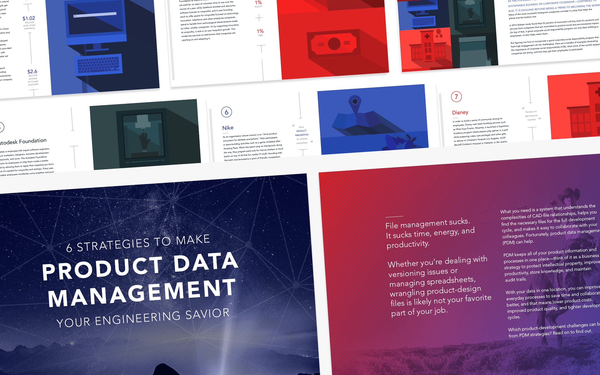
We worked with the great folks at Autodesk's Line//Shape//Space blog to create a series of featured eBooks. After reading through copy supplied by the Autodesk team, we worked to deliver a unique design for each–from ultra-modern to comic book. It was an opportunity for both teams to stretch out into new design territory.

Line//Shape//Space is run by Autodesk, creator of design software like AutoCAD, Revit, Maya, 3ds Max, Fusion 360, SketchBook, and more. Line//Shape//Space is dedicated to helping small businesses in the design and drafting space.
Line//Shape//Space has re-branded to Redshift. We helped them rebrand and define a new illustration style. Read about the process.
Product Data Management
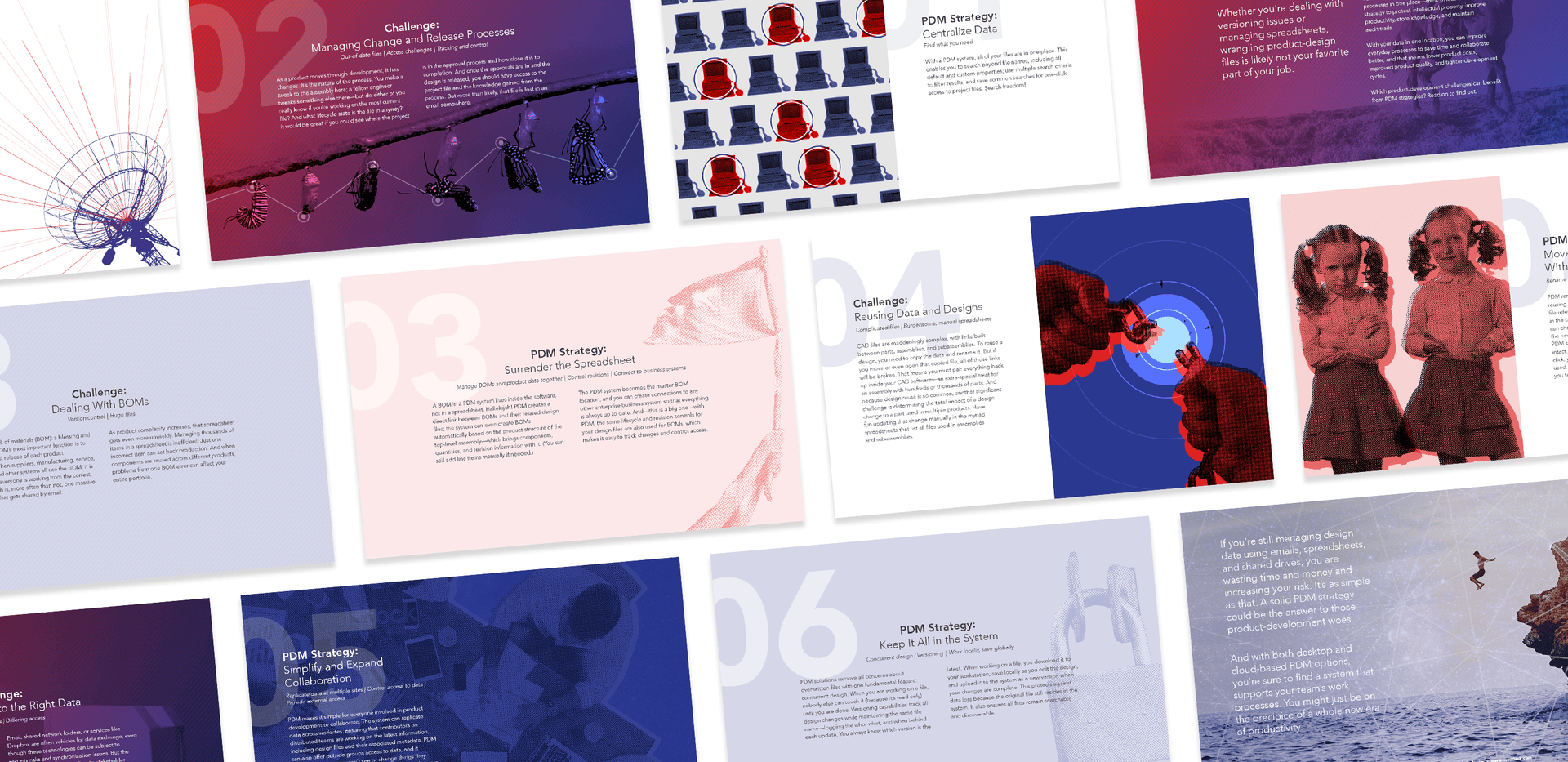
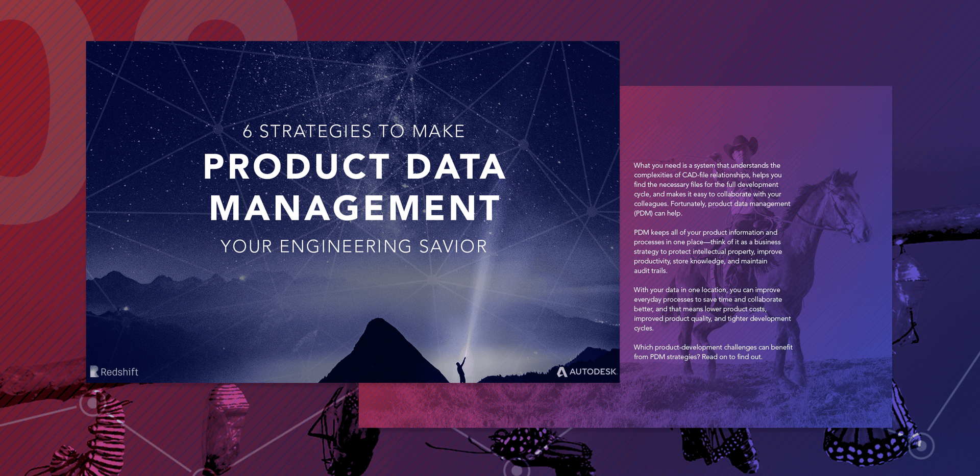
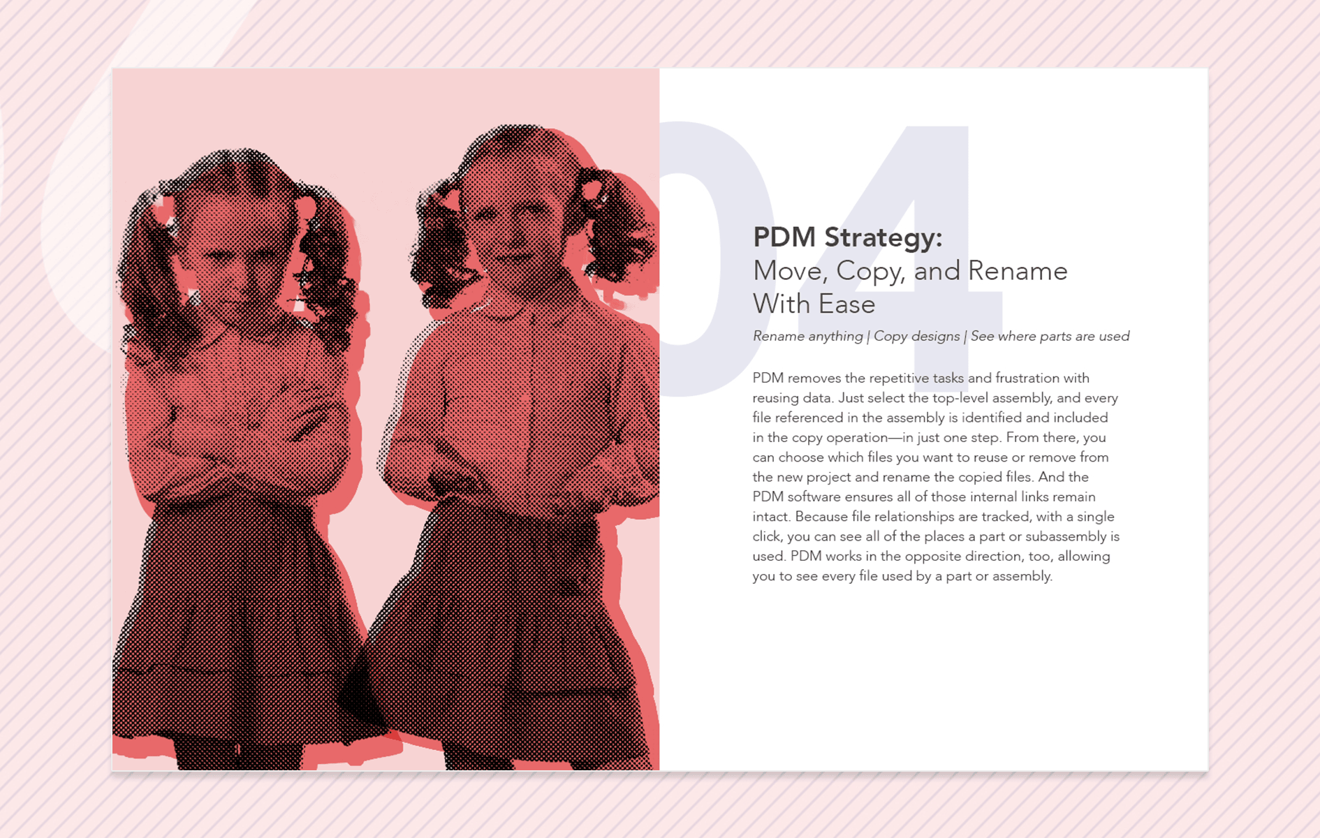
The team at Line//Shape//Space came to us with an eBook about product data management. The eBook featured six strategies to make file management more accessible, and featured a distinct problem/solution format.
When designing the layout, we aimed to utilize natural and humanistic elements to personify the information. We also used repeated patterns and visual elements to give the layout a cohesive feel.
We love how this one turned out. 💙
Corporate Social Responsibility
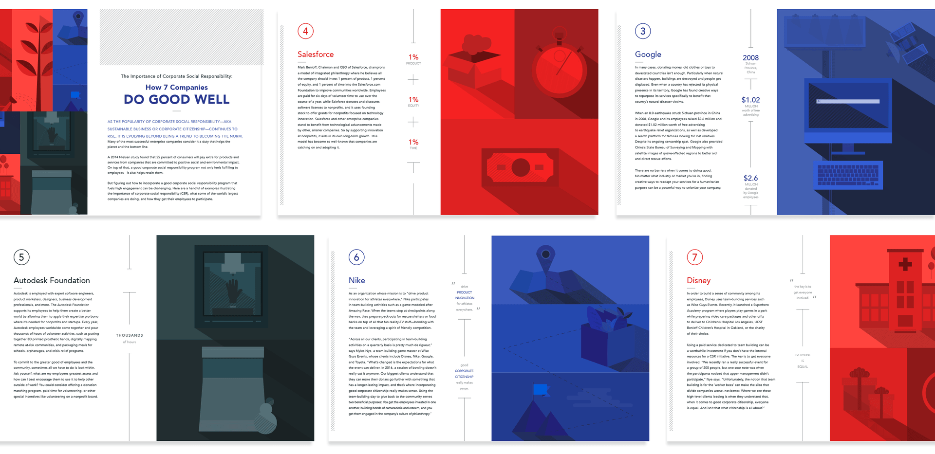
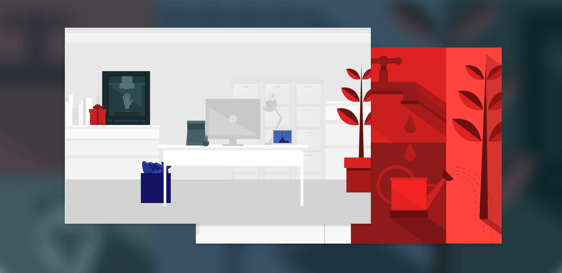
For the next eBook, the Autodesk team came to us with six examples of social corporate responsibility to illustrate and layout.
The design direction was for flat and minimal; the moody result includes a few animations and feature "a day at the office" as the central theme.
Read the eBook it here. 🖥
Sustainability
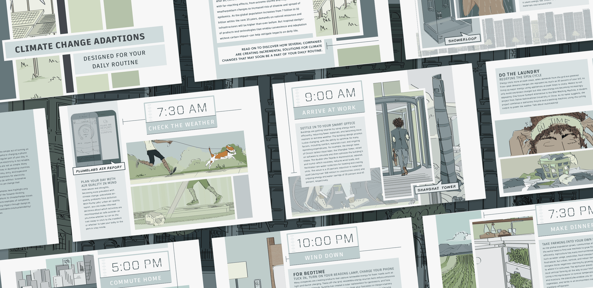
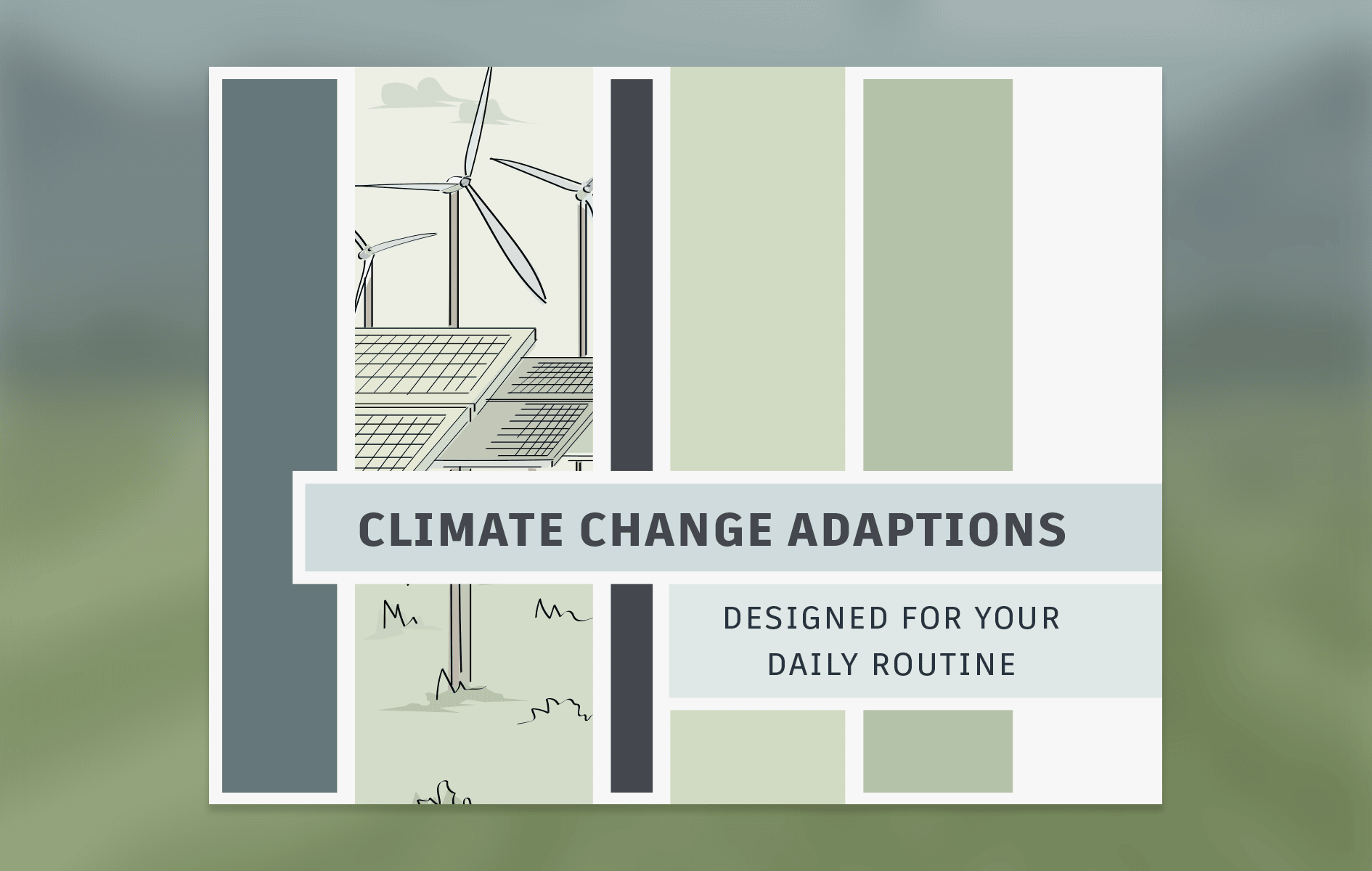
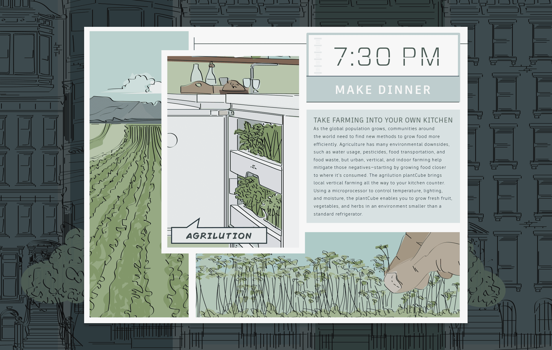
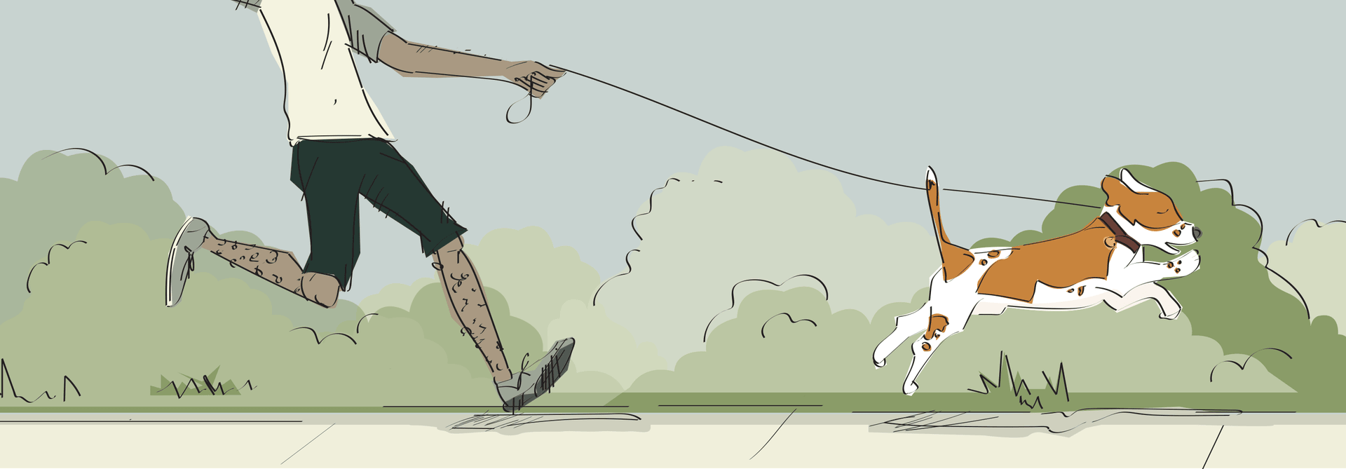
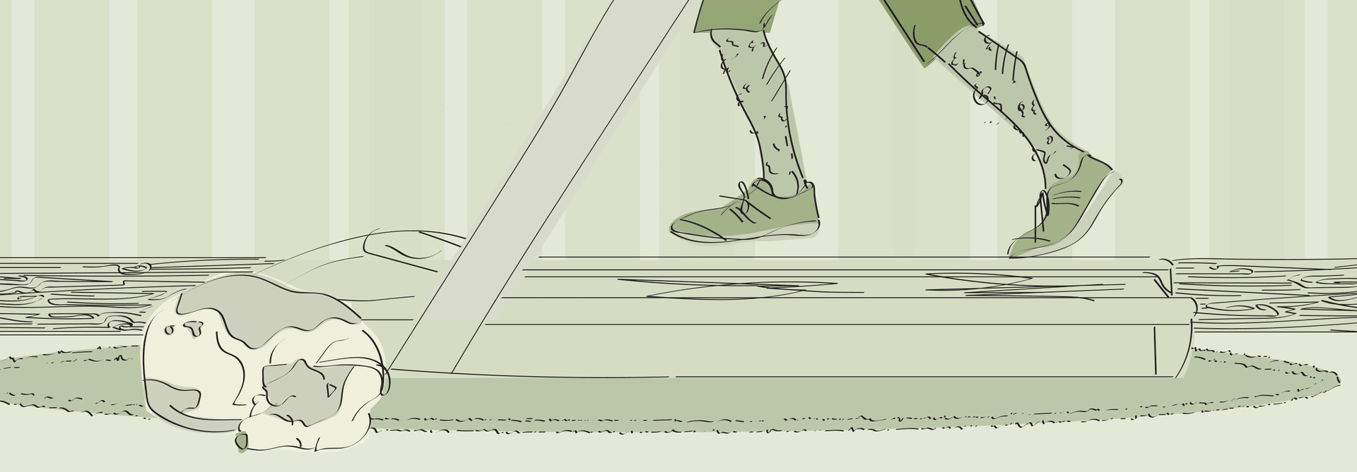
With this eBook on sustainability, the Autodesk team wanted the design to pull inspiration from graphic novels.
We honed in on a simple color scheme of neutral blues and greens. After syncing on the illustration style, we worked on laying out the body text, headers, call outs and illustrations into the graphic novel inspired format.
We think this one turned out really cool. 😎
Case Studies
See how we've worked with some of our great customers.
Get Started
Create an account to start setting up your brand.
Not sure what you need? See what we can do.
