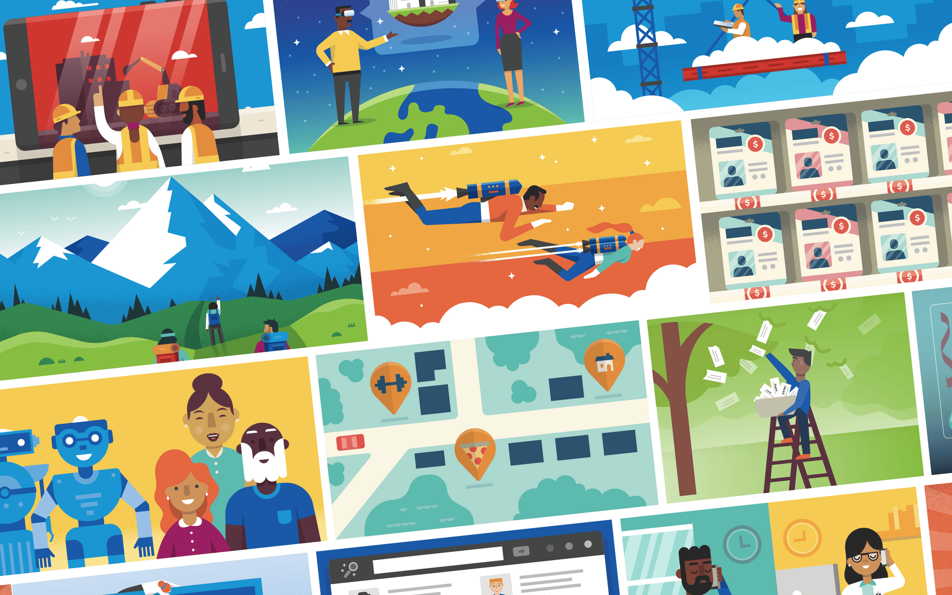
Defining An Illustration Style
Autodesk's Redshift blog partners with Lightboard to develop a unique illustration style for their editorial content.

Redshift explores the expanding forefront of architecture, construction, infrastructure, and manufacturing technology, focusing on the way the very nature of design is shifting. To give their content a distinctive and recognizable visual feel, Redshift worked with Lightboard to create needed a unique illustration style.
Redshift is supported by Autodesk, creator of software including AutoCAD, Revit, Maya, 3ds Max, Fusion 360, SketchBook, and more.

Design Direction
Redshift asked Lightboard to create a unique, flexible illustration style that would adapt to digital and print–and cover a range of scenes from characters to cityscapes.
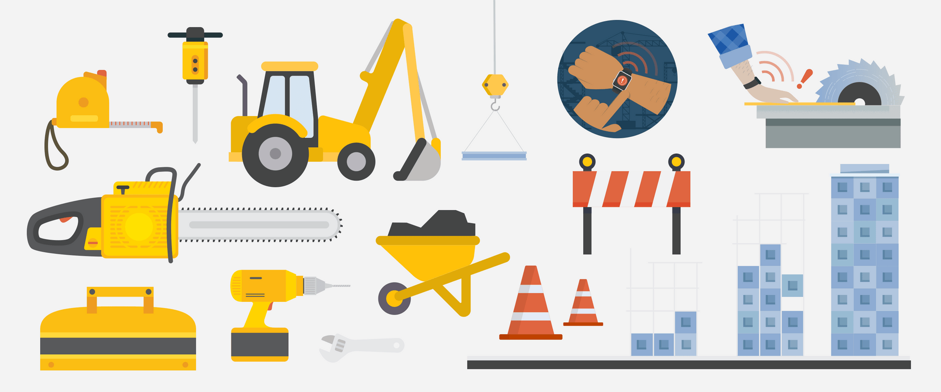
As a design partner, Lightboard ensures Redshift's illustrations feel consistent. Every final illustration appears as though it came from the same source. The style is defined by bold, simple shapes and strong colors. Textures and sharp lines of darker tones help to add dimension to the otherwise flat design aesthetic, providing a distinctive visual brand language for Redshift.





Defining a Style Guide
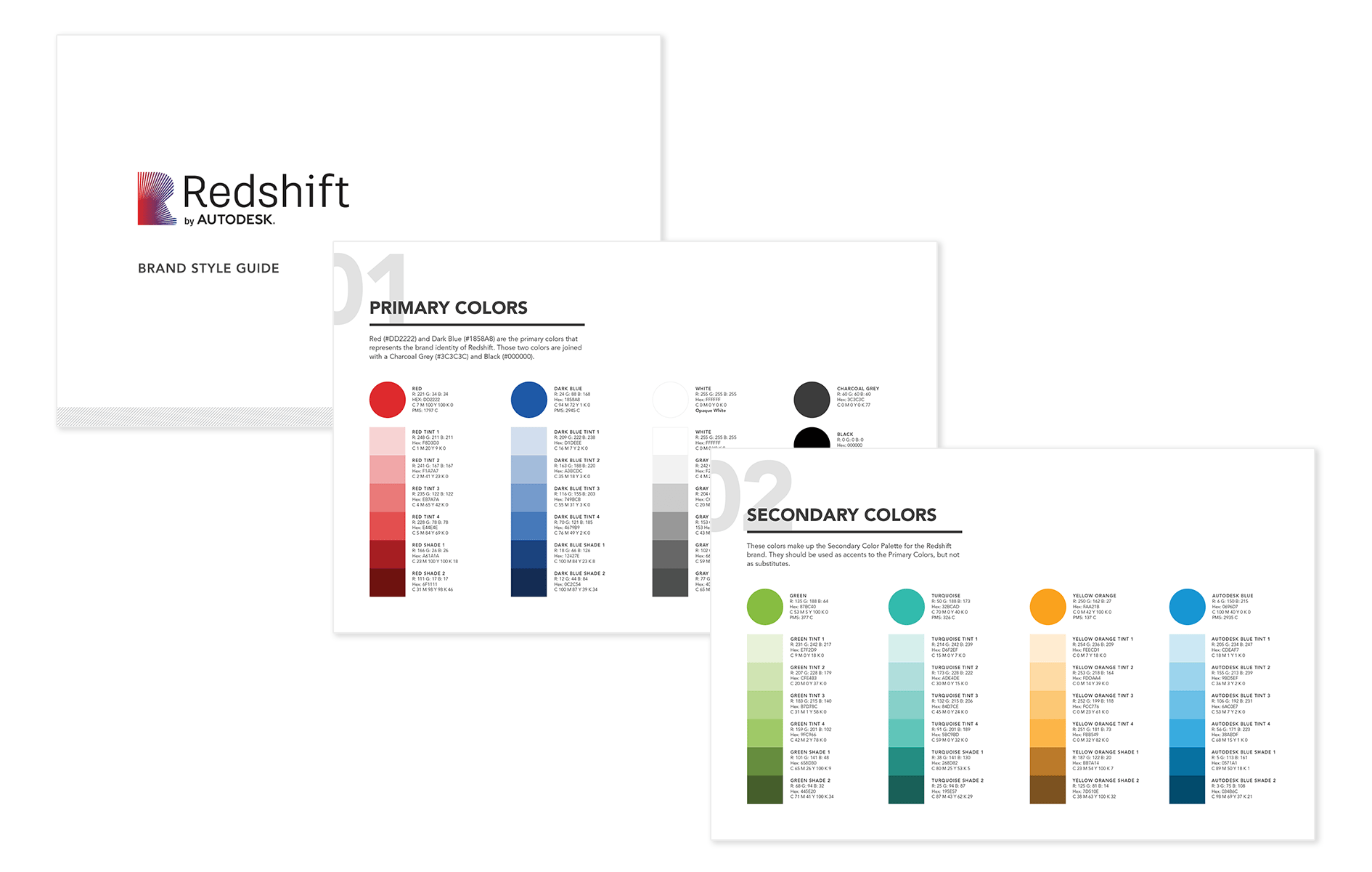
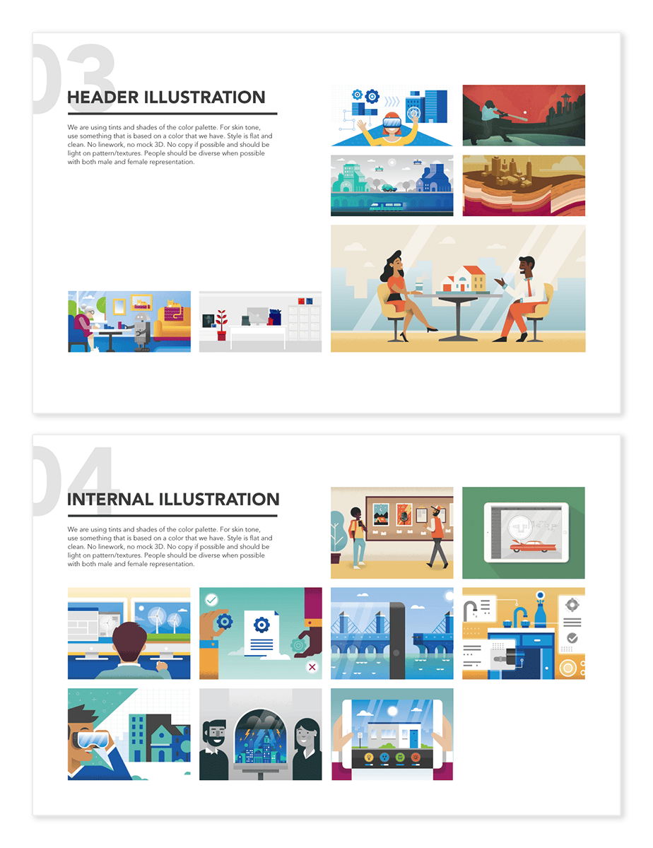
With the volume of illustrations we needed to produce for Redshift, we needed to formalize the look and feel with a style guide. Our goal: every illustration appears to be drawn by the same hand, no matter how many different people contributed.
Building a style guide for illustration is a challenge because of the breadth of possibilities. We distilled the attributes of the illustration style down to a few key traits: texture, shapes, and color.
With the guide in hand, the Redshift editorial team can maintain consistency across the editorial illustrations, and helps to quickly get a new illustrator up to speed.
Inspiration From Editorial
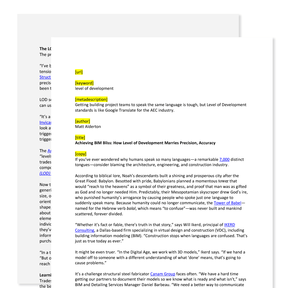
The Redshift team shares a copy of the full article with us well before we start work on the illustration.
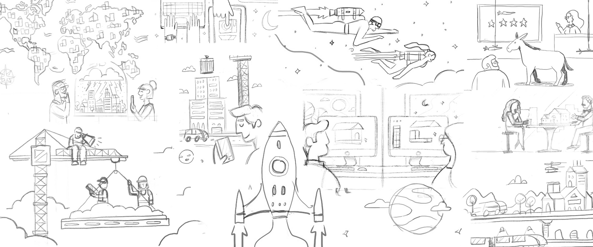
After reading the article, most projects start with a brief kickoff call with our Creative Services Manager, the illustrator for the project, and the Redshift editor to flesh out the scenes for the article. We start with rough sketches to confirm direction, and then deliver the polished work.
A Design Partnership
After more than a year, dozens of articles and more than a hundred illustrations, we're proud of our role in building the Redshift aesthetic.
We love working with the team at Redshift. Take a look at our motion graphics for Redshift and our work with the AutoCAD team.
Case Studies
See how we've worked with some of our great customers.
Get Started
Create an account to start setting up your brand.
Not sure what you need? See what we can do.
