A Quick and Efficient Brand Refresh
Usermind turned to Lightboard to refresh their brand identity to better reflect how their customer journey insights platform was innovating industry enterprise sales. Lightboard's team of designers quickly and cost-effectively refreshed Usermind's brand in three months, using our Membership program.
We work very closely with the Lightboard team to go from idea to concept to design for our brand refresh. Usermind is a complex SaaS product that can be hard to explain and the Lightboard team does a great job at taking a fuzzy concept and turning it into something much more meaningful.

David Henry
Senior Product Marketing Manager

Founded in 2013 in Seattle, Usermind provides the first unified data infrastructure platform for understanding and orchestrating the customer journey. Built for non-developers, Usermind makes it simple to integrate enterprise applications, map data between them, automate end-to-end processes, measure their impact, and take instant action to improve business outcomes.
Business Situation
After raising a $23.5M Series C, the Usermind team wanted to refresh their brand to reflect their premier status as a business operations platform. Focusing on design that would support their growing sales and marketing teams, Lightboard completed Usermind's rebrand with a brisk 3-month sprint.

Discovery and Design Exploration
The first part of our branding process is discovery: identify the customer's goals, understand the customer's market, and propose options to move forward. To start this project, Lightboard conducted extensive research into Usermind's competitors to identify trends and messaging that would inform Usermind's visual positioning.
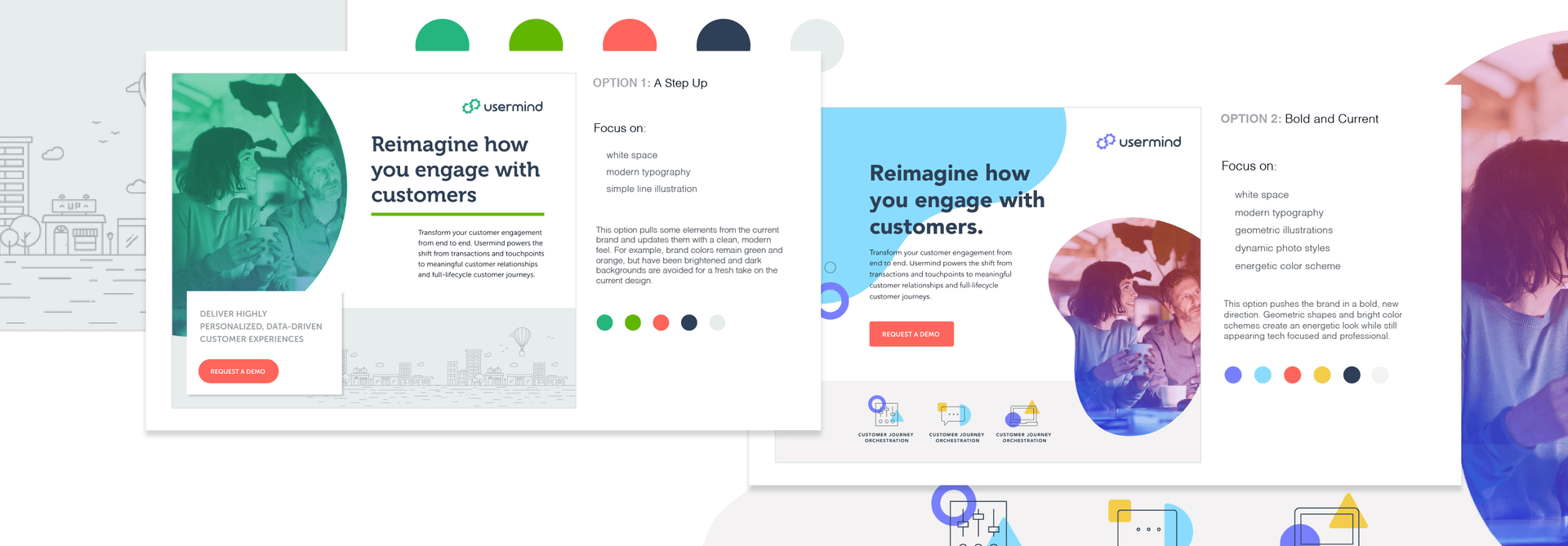
We presented Usermind with several different branding directions for discussion with variations focusing on modern, bold, bright, and dynamic visual identity styles.
As design partners, Usermind and Lightboard began to hone the key features that redefined their brand's character.
Design Refinement
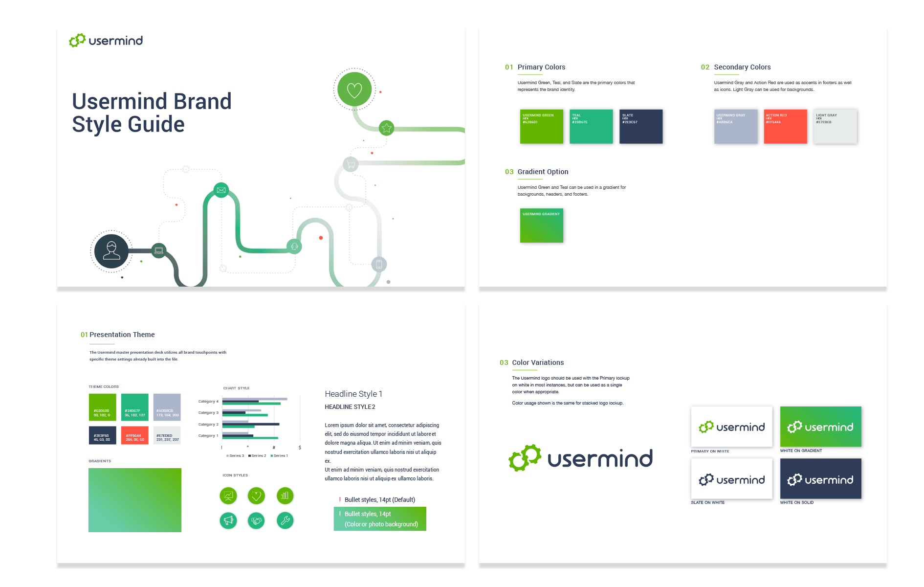
Client feedback and iterative design exploration shaped the overall look of Usermind's new visual identity. Once our teams arrived at a look and feel both sides were excited about, various marketing materials were used to further refine additional brand touch points.
Execution
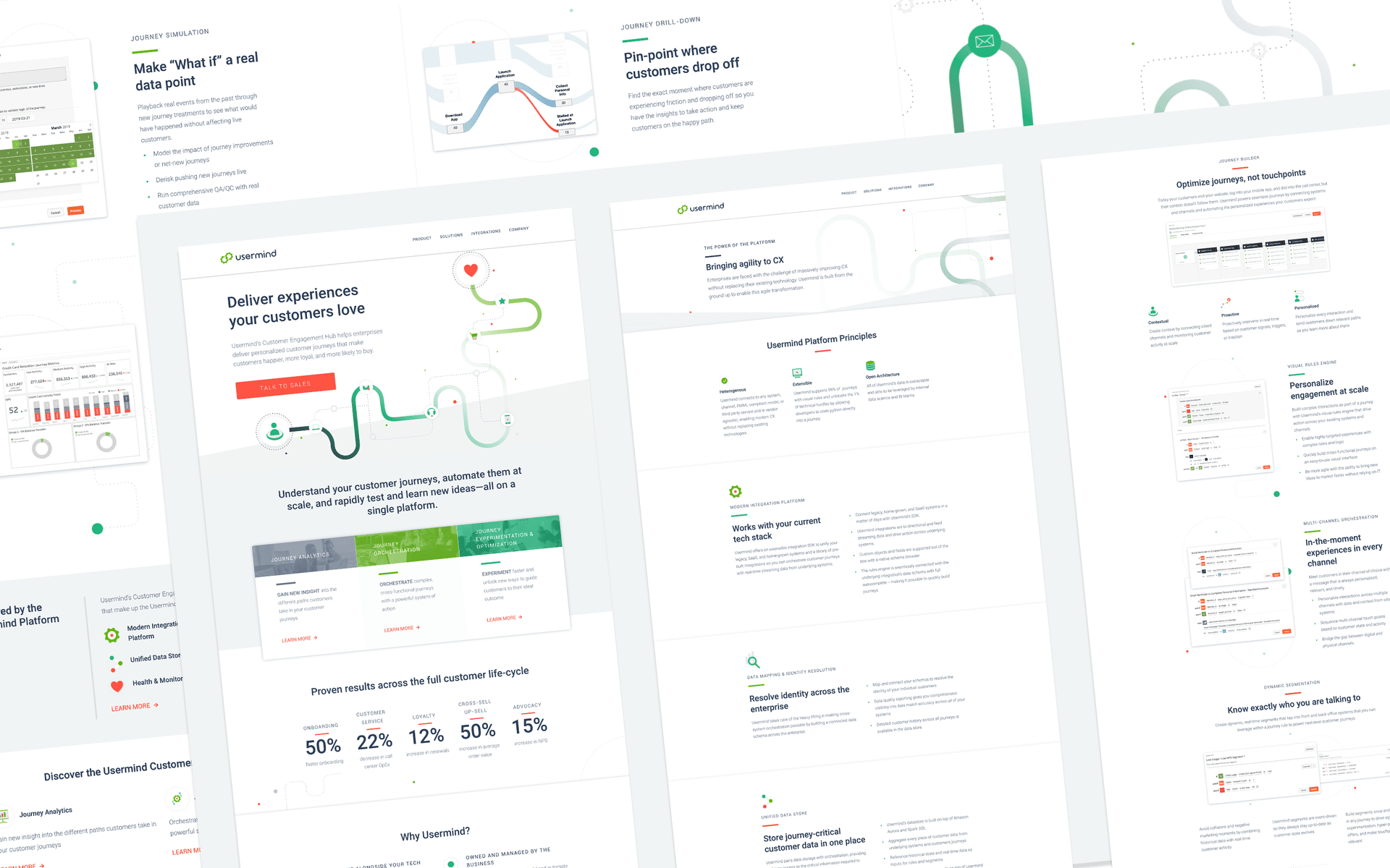
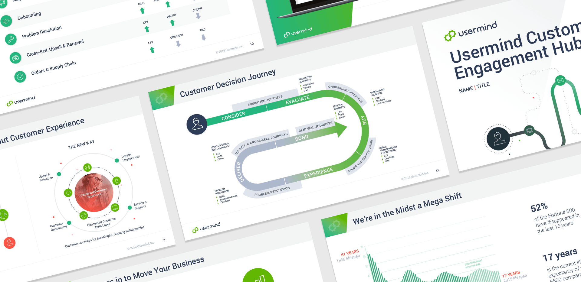
Usermind's refined visual identity makes use of dynamic images, crisp typography, an energetic color palette, and a mature illustration style. Lightboard applied this design direction across Usermind's entire brand, updating the company's website, presentations, case studies, PDFs, iconography set, and more.
Engaging Elements
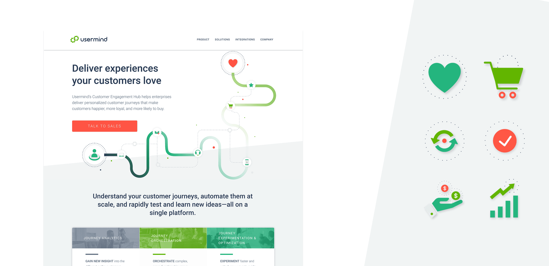
Icons play a key role strengthening Usermind's brand. These eye-catching visual cues help reinforce the integral aspects of Usermind's customer experience platform, while visually communicating customer journey ideas quickly and easily.

A Visual Language
By creating engaging, unambiguous, and flexible icons in Usermind's vibrant primary and secondary colors, these simplified visuals help communicate how Usermind is able to reveal useful business insights through a unified customer experience journey.
These icons are easily adaptable to work in other contexts, like hero image scenes, to further connect with audiences and create a compelling visual story.
A Website Experience Reimagined
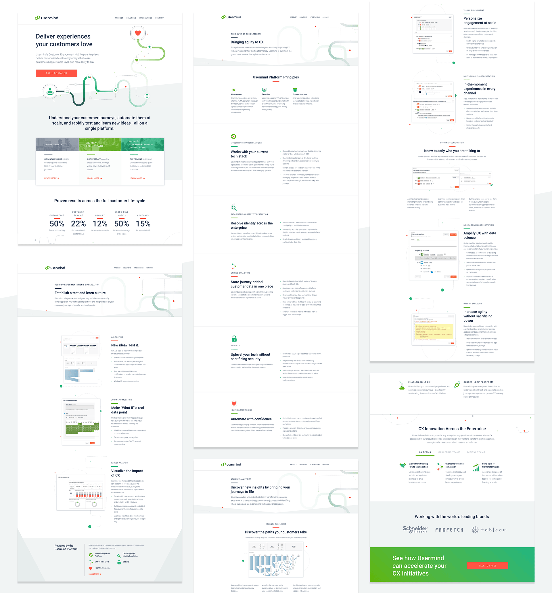
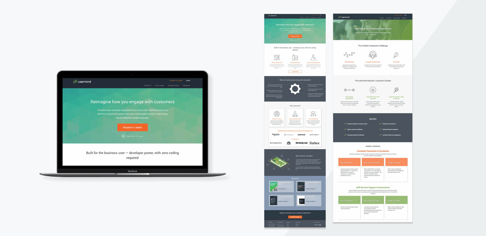
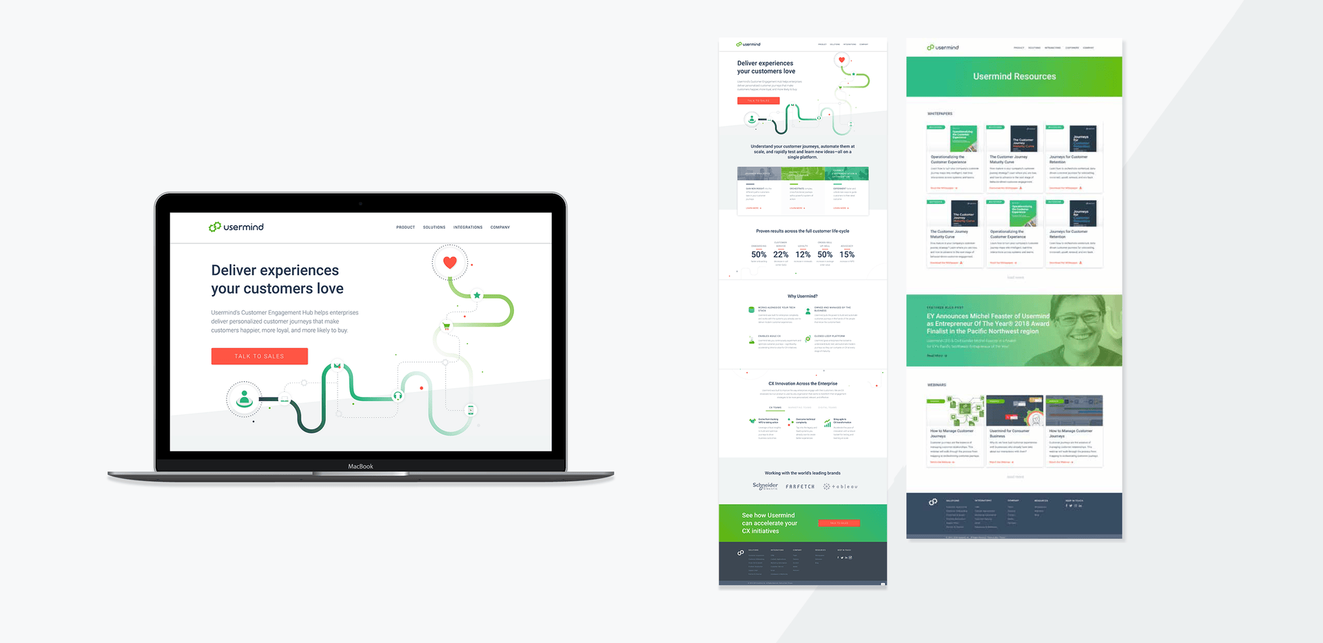
The most significant undertaking of Usermind's rebrand was reenvisioning their website. The process involved intensive information re-architecture. Through multiple wireframe and page design mock-ups, we were able to determine a revised page-layout and content strategy to reflect Usermind's new brand. The new website features a simple and user-friendly page structure that allows feature content and images to shine.
Benefits
Speed & Quality
Usermind wanted to inject new energy into their existing brand to better reflect its positioning as a leading customer engagement platform. Lightboard was a reliable and cost effective design partner that enabled Usermind to refresh their brand from start to finish.
We consider Lightboard to truly be an extension of our own team. I've worked with a number of different agencies and designers in the past and I have never had the efficient, personalized experience that we get working with Devin and Meagan. Their service, combined with the streamlined Lightboard app, makes it very easy to collaborate and deliver on projects.

David Henry
Senior Product Marketing Manager
Case Studies
See how we've worked with some of our great customers.
Get Started
Create an account to start setting up your brand.
Not sure what you need? See what we can do.
